
ASUS VivoWatch
An interactive product site implemented precisely across motion and responsive layouts.
Project brief
13 / 20- Client
- ASUS VivoWatch 5 AERO
- Type
- Brand and web
- Period
- 2022
- Status
- Original frontend delivered
- Collaboration
- Wooful led the design
- Scope
- Static frontend, RWD and product-motion implementation
Project overview
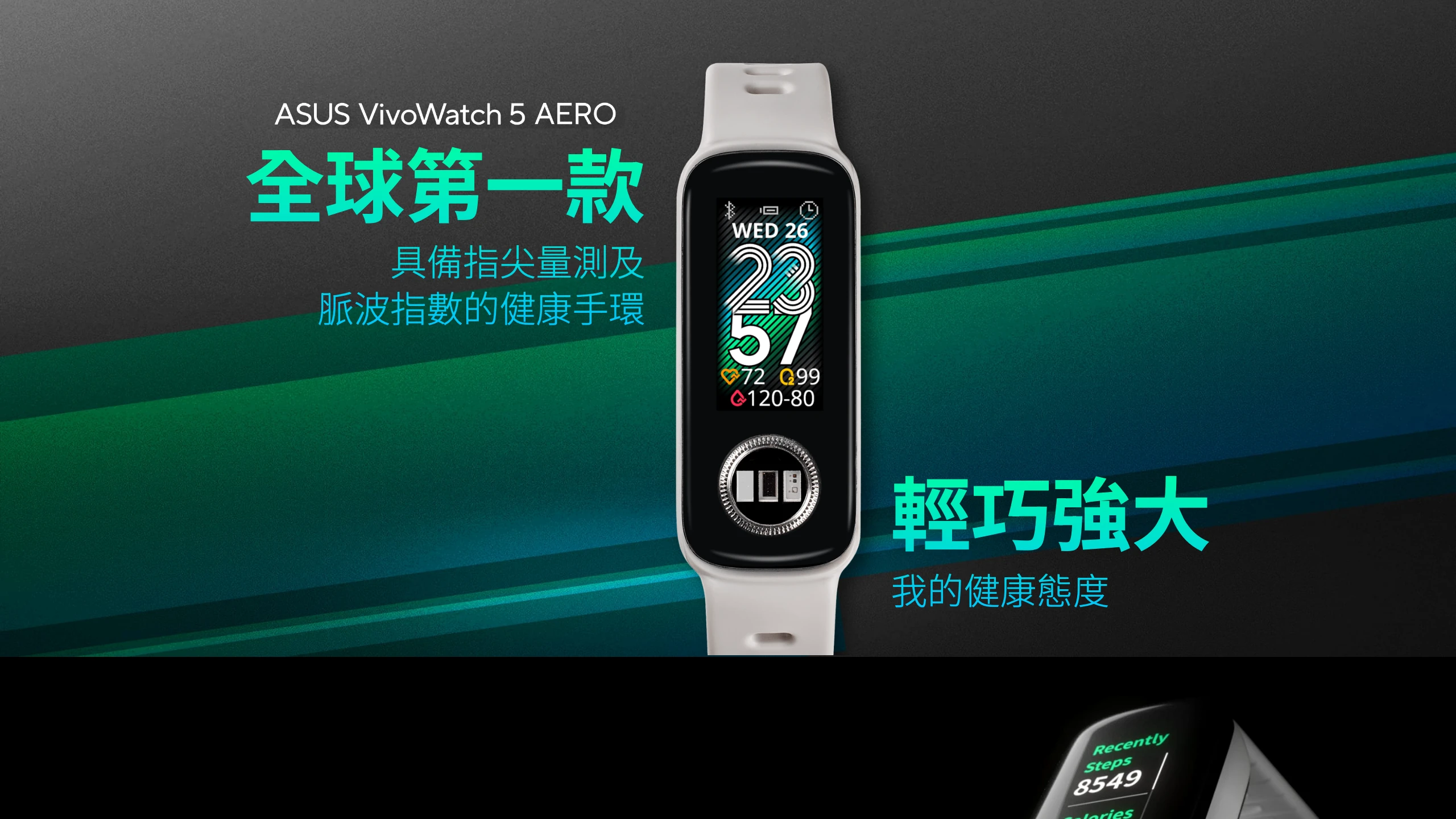
The VivoWatch product site needed to preserve the supplied image ratios, typography and motion rhythm.
We implemented the frontend precisely across screen sizes and browsers.
Key outcomes
Working flow
Product detail has to hold together on every device.
- 01 Asset analysis
Product imagery, masks, motion assets and responsive states are mapped before implementation.
- 02 Compose
Product imagery, watch-face masks and health motion were precisely assembled.
- 03 Reflow
Scale, layers and reading order were rearranged for smaller screens.
Making the approved product story work in the browser
Type, spacing, image crops, timing and breakpoints collectively determine quality. Each section and asset was tuned so the visual hierarchy survives across devices.
A clear frontend role within a design partnership
Our role was deliberately focused on frontend engineering: accurate implementation, responsive adaptation and browser testing that carried the design team's work into production.
Motion sits inside the product, not beside it.
Health and ECG motion was placed through a watch-face mask and composed with the product image so it reads as an aspect of the device, not a generic web animation.
Motion and responsive behaviour were tested as one system.
Watch-face GIF masks, AOS sequences and Swiper interactions were checked across browsers and narrow screens. Layer order, cropping and reading sequence were adjusted instead of merely shrinking the desktop composition.
Next case
安沛購物商城 →